Color Psychology in Interior Design: How Color Shapes Mood
There’s something that always happens when I step into a home for the first time: before I look at the furniture, before I study the layout, color is already speaking. Color sets the emotional rhythm of a space. It can calm us or energize us, wrap us up or clear our minds, make us feel at home or, quite simply, out of place.
Is there an exact, universal science behind it? Not entirely. We all carry different memories, experiences, and associations. But in interior design, one practical truth holds: color is one of our most powerful tools to shape atmosphere. Used well, it can transform a room completely without moving a single wall.
Here’s my take on the most used colors in interior design, what they tend to communicate, and where they work best.
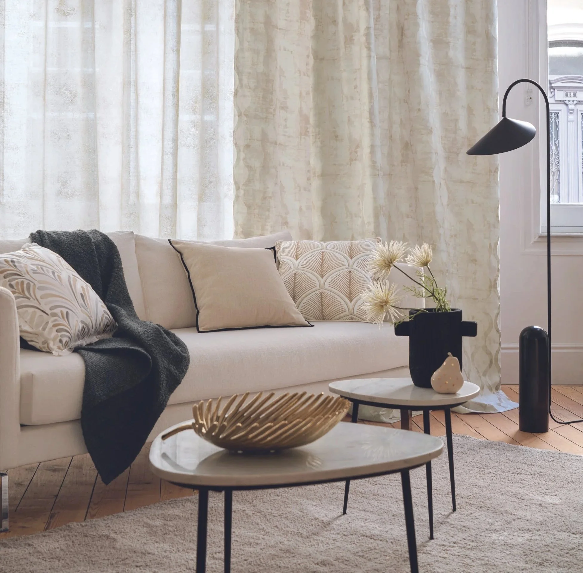
White brings light, visual clarity, and a sense of openness. It’s ideal for smaller spaces, for making ceilings feel higher, and for creating a timeless foundation. When layered with texture such as linen, wood, or ceramics, it feels warm, never cold.
Black is my go to for character. It’s elegant, deep, and instantly elevates a space when used with intention, whether that’s in trim details, hardware, accents, or one strong statement piece. Too much can dim a room; the right dose makes it feel refined and sophisticated.
Blue communicates calm, balance, and rest. It works especially well in bedrooms and bathrooms, and in any area designed for unwinding. I prefer softer blues for sleep spaces, and deeper shades only when there’s beautiful light and warmer materials to balance the coolness.
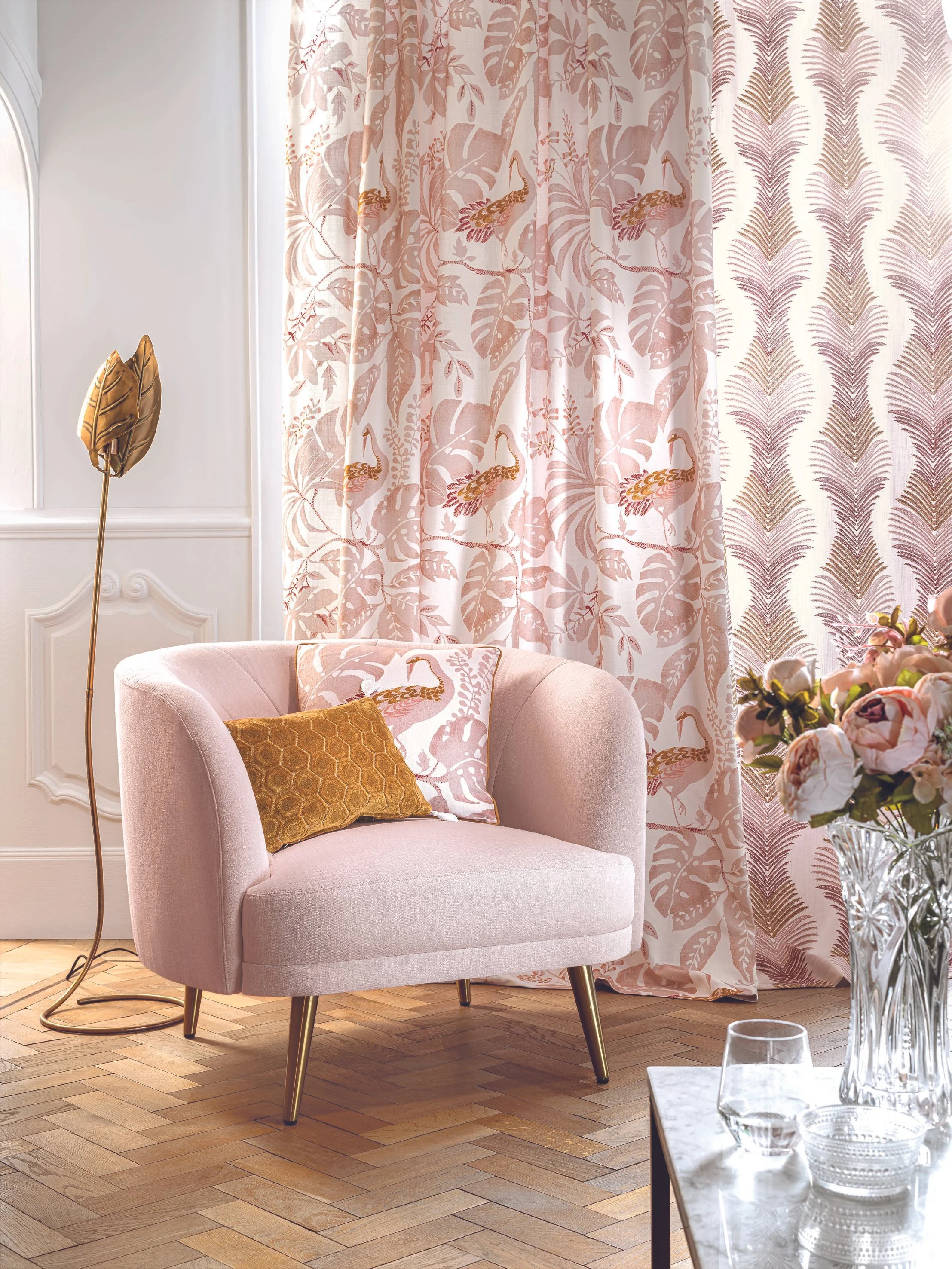
Red adds energy, warmth, and connection. It’s a social color, perfect for dining rooms or areas where you want conversation and movement. I gravitate toward richer, earthier versions like terracotta or brick, because they feel enveloping and integrate more naturally.
Purple shifts dramatically depending on the tone. Deep purples feel luxurious and dramatic; soft lavenders feel peaceful and soothing. It becomes truly editorial when paired with velvet, brass, or classic silhouettes.
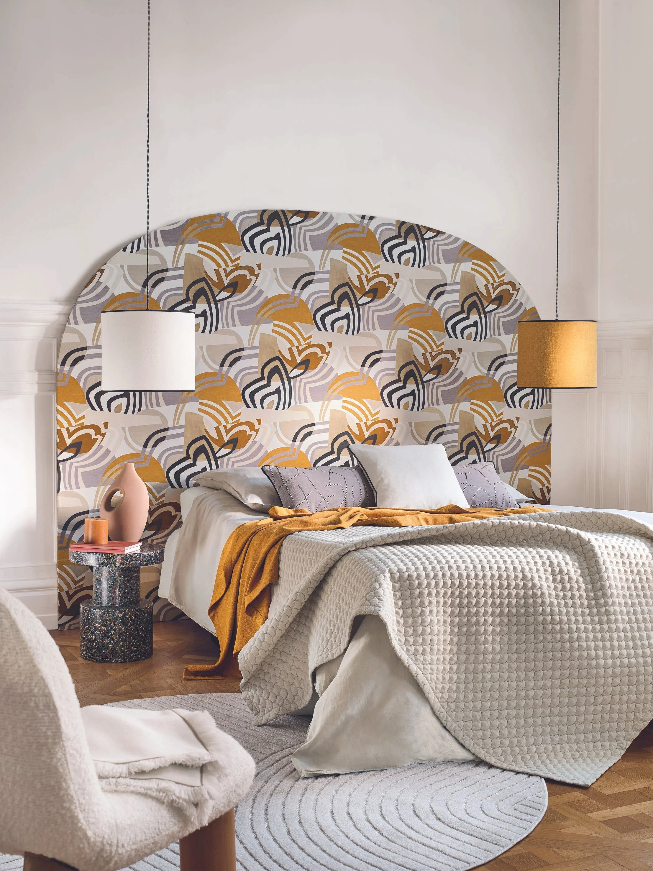
Yellow is emotional sunlight. It brings optimism and vitality, especially in kitchens, entryways, or corners where you want a sense of brightness. If you’re not ready for it on the walls, introduce it through accents such as art, cushions, or a lamp.
Pink brings softness and balance. Pastel pinks feel calming, while dusty and greyed pinks read elegant and contemporary. In wallpaper, textiles, or a single focal element, it can transform a living room with quiet sophistication.
Choosing color is choosing how you want to feel at home. If you’d like help refining your palette based on light, square footage, style, and how you actually live in each room, at Estefani Batista Interior Design we work with you so the result isn’t just beautiful, it feels exactly right.